The Psychology of Branding Colors: Selecting the Right Color Palette for Your Business
Color is the strongest branding element. It determines perception, inspires feelings, and informs customer interaction with your business. A well-chosen palette of colors can enhance brand strength, increase recognition, and even influence customer actions. This book examines the psychology behind colors used in branding and gives tips on how to pick the ideal palette for your company.
Why Colour Psychology Matters in Branding
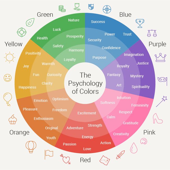
Color psychology is the practice of understanding the effect of color on human emotion and behavior. Colors convey meaning and create associations in the consumer’s mind during branding. According to research, consumers make subconscious judgments about a brand within 90 seconds of initial exposure, and as much as 90% of this judgment is a function of color.
A considered color scheme will:
- Stimulate certain feelings and moods.
- Reinforce brand awareness and recall.
- Drive purchase decisions.
- Distinguish your brand from others.
- Build trust and credibility.
Learning the Significance of Colors in Branding
1. Red: Passion, Energy, and Urgency
Red is a strong, attention-grabbing color that represents excitement, passion, and urgency. It provokes emotions, raises heart rates, and is frequently utilized in clearance sales and fast-food branding.
Best for: Food, entertainment, retail, and health-related businesses.
Examples:
- Coca-Cola – Utilizes red to create excitement and happiness.
- Netflix – Uses red to generate a sense of urgency and interest.
2. Blue: Trust, Stability, and Professionalism
Blue comes with trust, reliability, and serenity. It’s mostly applied in business branding, financial services, and technology sectors as it creates trust and professionalism.
Best suited for: Banks, technology, healthcare, and business brands.
Examples:
- Facebook – Symbolizes trust and safety in social networking.
- IBM – Signifies stability and professionalism in tech.
3. Yellow: Happiness, Friendliness, and Cheerfulness
Yellow radiates warmth and positivity. It’s an attention-grabbing color that stimulates the sense of happiness and warmth and, therefore, works best for those brands seeking to project friendliness and cheerfulness.
Ideal for: Children’s, food, and retail brands.
Examples:
- McDonald’s – Implements yellow to associate joy and friendliness.
- IKEA – Relays affordability and optimism.
4. Green: Health, Growth, and Sustainability
Green is linked to nature, health, and calmness. It’s widely used in eco-friendly, organic, and financial institutions brands.
Ideal for: Health, wellness, money, and environmental brands.
Examples:
- Starbucks – Symbolizes freshness and sustainability.
- Whole Foods – Represents natural and organic living.
5. Orange: Innovation, Fun, and Passion
Orange is a fun and lively color that inspires passion and creativity. It is frequently used by companies that intend to look friendly and accessible.
Best for: Entertainment, technology, and sports brands.
Examples:
- Nickelodeon – Appeals to children with its playful and lively atmosphere.
- Fanta – Symbolizes playfulness and excitement.
6. Purple: Luxury, Wisdom, and Royalty
Purple is associated with creativity, sophistication, and exclusivity. It’s usually employed by brands that wish to express a feeling of luxury and high quality.
Best for: Beauty, fashion, and high-end brands.
Examples:
- Cadbury – Symbolizes premium quality and indulgence.
- Hallmark – Implies creativity and elegance.
7. Black: Sophistication, Power, and Elegance
Black is an evergreen color that signifies exclusivity and sophistication. It’s commonly utilized in luxury and premium brands.
Best suited for: Fashion, luxury, and tech brands.
Examples:
- Chanel – Signifies elegance and exclusivity.
- Nike – Adds a sense of power and dominance.
8. White: Simplicity, Purity, and Minimalism
White conveys simplicity, cleanliness, and transparency. It is used in health, beauty, and technology branding to project modernity and openness.
Ideal for: Healthcare, tech, and minimalist brands.
Examples:
- Apple – Envisions innovation and simplicity.
- Tesla – Emphasizes minimalism and futuristic pull.
How to Select the Ideal Color Scheme for Your Brand
Step 1: Know Your Brand Personality
Establish your brand’s personality, values, and the feelings you wish to inspire. Ask yourself:
- What are the core values of my brand?
- How do I want my customers to feel?
- What business am I in?
Step 2: Know Your Target Audience
Various colors evoke different responses across cultures and demographics. Learn about your audience’s color preferences and cultural color associations.
Step 3: Analyze Competitor Branding
Observe the color schemes used by competitors. If a particular color dominates your industry, consider using complementary or contrasting colors to stand out.
Step 4: Choose Primary and Secondary Colors
- Primary Color: The dominant color that represents your brand identity.
- Secondary Colors: Additional colors that support and complement your primary color.
Step 5: Test and Optimize
Perform A/B testing with various color schemes to determine which best speaks to your target audience. Monitor engagement metrics, customer feedback, and emotional feedback.
The Role of Color Combinations in Branding
Applying color combinations wisely can strengthen brand recognition and provide an aesthetically pleasing design.
- Monochromatic: Shades of the same color (blue and light blue) for a uniform look.
- Analogous: Colors adjacent to one another on the color wheel (red, orange, and yellow) for a harmonious atmosphere.
- Complementary: Colors which are opposite one another on the color wheel (blue and orange) for high contrast and visibility.
- Triadic: Three equidistant colors on the color wheel (red, yellow, and blue) for equilibrium and liveliness.
Conclusion
Color psychology is an essential aspect of branding, as it determines how your customers perceive and engage with your company. Through the strategic choice of the perfect color scheme, you can make your brand unforgettable and effective. Take into account your brand values, customer preferences, and sector norms when picking colors, and always experiment with various combinations to achieve the best results.
With the appropriate colors, your brand can create a robust visual identity, foster trust, and generate customer engagement. Make the right choices and let your brand colors do the talking!
For More Information, Contact Us: Brand Solution Agency – Just another WordPress site
Our Blogs:
How to Build Brand Trust and Credibility with Your Audience
How to Build a Memorable Brand Identity – Brand Solution Agency
The Psychology of branding Colors…
Brand Loyalty vs. Brand Awareness: Which is More Important?
Personal Branding vs. Business Branding: Which One is More Important?
Top 5 Influencer Marketing Strategies to Boost Your Brand